Your basket is currently empty!
Multiple
-
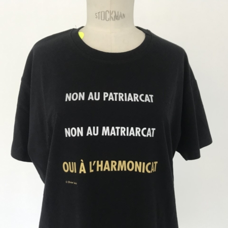

Olivier Leroi, T-shirt
30,00€Unlimited edition
Production Piacé le radieux 2022Choix des options Ce produit a plusieurs variations. Les options peuvent être choisies sur la page du produit -
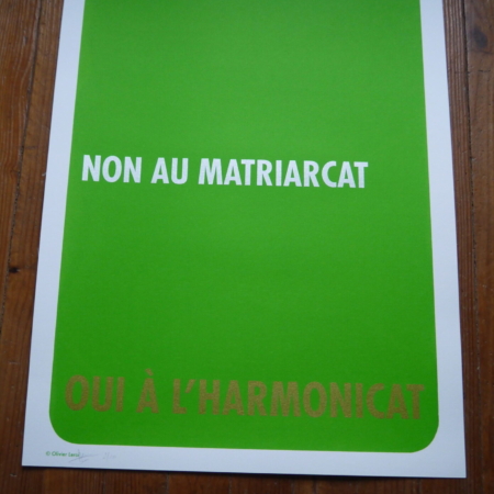

Olivier Leroi, Oui à l'harmonicat, Silkscreen print
100,00€Olivier Leroi, screen printing No to patriarchy No to matriarchy Yes to harmony
Price details: First 30 screen prints: €100
from 31st to 60th: €150
from 61st to 100th: €200 -

Christian Ragot, Siège OC, reprint
The OC chair, the basic element of Modul'OC, was produced in a dozen copies in 1971 at the time of the Larzac struggle. A symbol of the revival of an Occitanie refusing the expansion of the military camp, it reflects the design spirit of Christian Ragot. A design full of freedom and humour that questions our society and our lifestyles.
Reissue of 100 copies.
Straw bale, black tarpaulin and crystal 550g
10 copies available
Other colours to follow. -
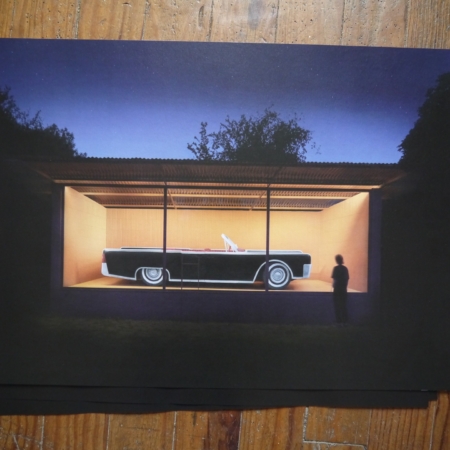

Ronan Bouroullec/Pascal Rivet, Lincoln Pavilion, Poster
30,00€Poster 65×46 cm
Four-colour printing Arena Natural paper 200g/m2
Unlimited edition, unsigned, stamped
Production Piacé le radieux 2022 -
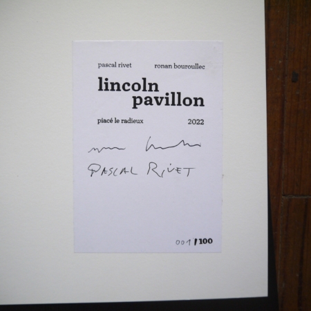
Ronan Bouroullec/Pascal Rivet, Lincoln Pavilion, Poster signed
100,00€Poster 65×46 cm
Four-colour printing Arena Natural paper 200g/m2
Limited edition
100 stamped, signed and numbered copies -
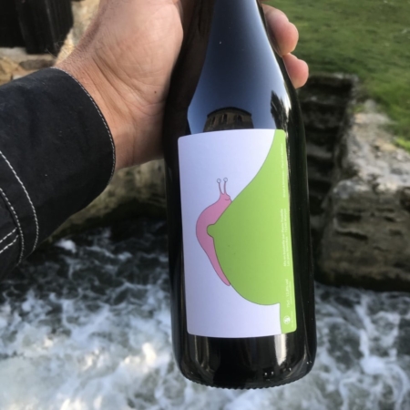

Bottle of wine, Mrzyk & Moriceau I'm sticking with you
15,00€Bottled by Pierre Pradelle - les pies blanches - 72340 Marçon
Unlimited edition, on the occasion of La Quinzaine radieuse #13, 2021
-
-
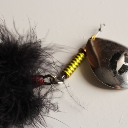

François Curlet, La V.I.P, fishing spoon
100,00€Limited edition, signed and numbered
Production Piacé le radieux 2009. 100 copiesThe spoon is an object intended for contact with the mouth of fish.
The black lipstick motif recalls the kisses of death, and the black feathers the folklore of the V.I.P. aesthetic.
The perforated base in the blister pack is reminiscent of hotel room door hangers. The "tatoo R'nb" typeface reactivates the image of a kiss.
The word SILENCE activates its use: hanging on a branch next to the fisherman. -
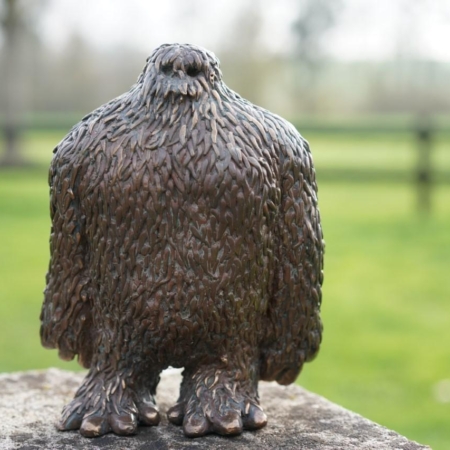

Ibai Hernandorena, Yeti
1200,00€12 copies, certificate signed and numbered by the artist
1200 for the 1st copy and +10% for subsequent copies -
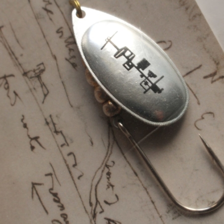

François Curlet, La Corbu, fishing spoon
100,00€Limited edition, signed and numbered
Production Piacé le radieux 2009
100 copiesPlan of the radiant farm logotypeand printed on the palette of a classic n°5 aglia spoon, assembled with a single hook for a retro line.
The spoon is an object that launches itself into the landscape, with Le Corbusier's plan printed on it.
The card reproduces a page from the architect's sketchbook, showing the village of Piacé. -
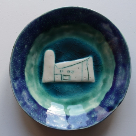

Norbert Bézard, Re-edition of the Chappelle de Ronchamp plate
300,00€Production Piacé le radieux 2013
50 numbered copies -
-
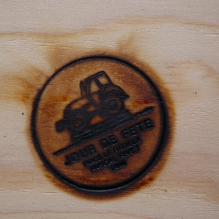

Pascal Rivet, Jour de fête
30,00€Edition produced following Pascal Rivet's "Jour de fête" Midsummer bonfire on 20 June 2015 in Piacé.
Wooden box 11.5 x 15.5 x 4 cm with hot iron markings containing ashes, nails and screws.
50 copies."The initial purpose of this wooden tractor was not to "go up in smoke...". However, little by little and in an increasingly insistent way, the idea of seeing it disappear (after having seen it slowly built...) "germinated" to the point of becoming a possible, absurd, baroque and tragic outcome to this sculpture project. The idea of a fire took hold, like the tractor's funeral, becoming its own pyre and its own wooden coffin. Twilight images, the body caressed by the flames, consuming itself "slowly". A "rural" Crash.
Pascal Rivet -
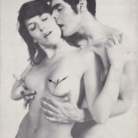

Stéphane Vigny, Miss and Mister O'Clock, 2020
200,00€Piacé le Radieux Edition
Clock on image printed on cardboard, Framed, 210 x 297 mm
12 signed and numbered copies
sold out -
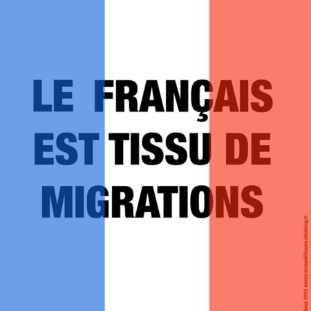

Joël Auxenfans, Le français est tissu de migrations, 2017
5,00€My flag doesn't have the same blue and red as right-wing and far-right posters: its blue is bright, light cobalt, like Monet's or Manet's Bastille Day posters, joyful like the blue of the Liberation, which was fought precisely against the ancestors of today's Front National, who simply stole the acronym "Front National" from the largely Communist liberation organisation that included so many heroic foreigners! The red is bright, somewhere between pink, vermilion, carmine and orange, a red of courage, youth and joy. Above all, the transparency, which you would never see in a far-right poster, all opaque, hard, with something martial and vengeful about it, always seeking, through suspicion and gossip, to cast hate on the defenceless innocent. This transparency says it all about a project that is sovereign, peaceful, reconciliatory, generous, full of hope and above all courageous (in these times of media cowardice). Behind the effect that changes the black of the letters into blue or red, we can see the idea that light shines through the thought of a real political project, a light that speaks of peace, "luxury, calm and pleasure", without which any project plunges irreversibly into the seizure of power by a clan closed in on itself and its habits of thinking among itself. Can today's artists make themselves useful, or are they condemned to the speculative race to make the most of the ill-gotten fortunes of thieves and their tax lawyers? That's one of the questions raised by this flag. For some who claim to be in their place to "defend the people", it must finally be understood that ugliness and the absolute absence of eloquence and spirituality are not - at least for humanity - a persuasive prospect, and that it is not a question of submitting to seduction but of cultivating the ability to integrate into a political project the faculty of accepting life that cannot be controlled or decreed, and of which art is the first, fiercely attached to its freedom of expression.
-
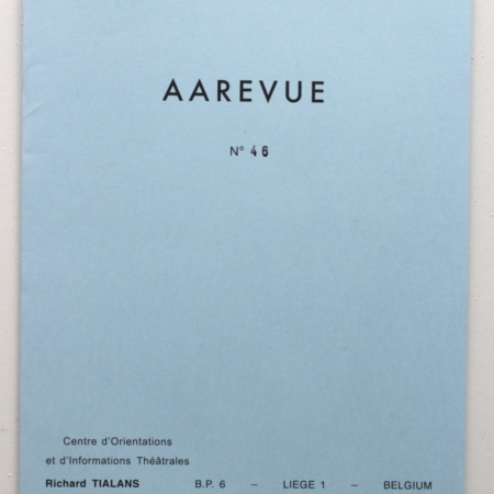

George Brecht, Robert Filliou, Aarevue
10,00€Edition Piacé le radieux / Air de Paris 2012
200 copies
-
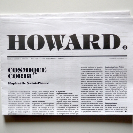
François Curlet, Howard Newspaper, Peopleday®
1,00€Edition Piacé le radieux 2010 5000 copies
Under the name Peopleday®, François Curlet creates works using multiples and one-offs by artists from previous generations. In 2006, to coincide with the FIAC, he co-ordinated the publication of a journal entitled "Howard", in which people from the art world - critics, artists, etc. - were invited to write in a no-holds-barred way about the inner workings of the art world. Four years later, to coincide with the Quinzaine Radieuse #2, the Piacé le radieux association published the second Howard journal. The layout was still designed by the Belgian collective Donuts, and the articles (by Raphaëlle Saint-Pierre, Jean-Marie Bézard, Jean-Louis Poitevin, Judith Benhamoun etc.) and drawings were free in tone, focusing on Le Corbusier, Piacé le radieux, rural life and art in general.
-

-
-
End of content
End of content